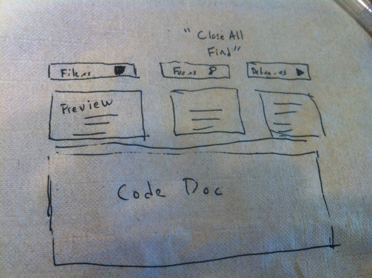
Napkin Idea: Code Tabs
Tabs were introduced in Visual Studio 2003 (although addins existed for Visual Studio 6). This is how they look now in Visual Studio 2010:

My best guess is that developer’s have a love/hate relationship with tabs. They’re great when they work, but many times they get cluttered, and developers have to go nuclear on them (“Close All Tabs”).
A simple fact is that many times developers simply forget what the heck was in the tab. Research backs this up: Ko et. al found developers relied on environmental cues such as tab placement and scroll bar positions in documents to know where anything is. In work looking at recorded navigation history of developers, commonly there will be patterns where developers will frantically switch around documents (“navigational jitter”) as they’re trying to find the right tab.
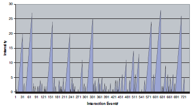
A second problem with development is context explosion. A developer’s task context typically involves a few files, but will quickly explode when exploring, debugging or searching through files. Above is a snapshot of one developer’s session measuring the number of actions (edits,clicks,etc) taking on a file before switching. You may notice that the developer focuses on one element for a while, before jumping around several locations until settling in the next major location of focus.
The napkin idea
What if we did two things. First, let’s put a preview of the content in the tab. Memory research suggests that “names” are poor cues for recall. Second, let’s associate the tab with the major action it was involved with.
Update (New Screenshot):

Below the name is a small document preview. Thea action icons indicate how the document was used. “Search”, “Debug”, “Edited” icons let you know what you did with a tab and being able to perform grouping and pruning operations, such as closing all tabs opened in a search.
This can go in many directions. Tabs, love them or hate them, can really use a make-over.
blog comments powered by Disqus