Code Diffs Redesigned
Viewing source code differences is something programmers do almost daily. Yet, how we view diffs is little changed since some of the first tools came out in the 1970s. Sure, techincal improvements have been made (accounting for whitespace, word-level diffs, providing more context, structural diffs).
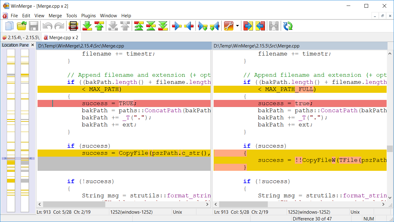
But for the most part, tools either dump out plain text, or provide a side-by-side view of two colorized text files, in typically hideous color schemes. Thumbnail views are a nice touch. Overall, these views are great for detailed tasks when doing a merge or making absolute sure a character was not inadvertently mangled. All said, they are terribly verbose and sluggish for more casual tasks such as to check up on recent code changes team members made, or reminding yourself of recent changes you’ve when you were last working on a task.
Here are some approaches I’ve been tinkering with that can provide some alternative ways of working with diffs:
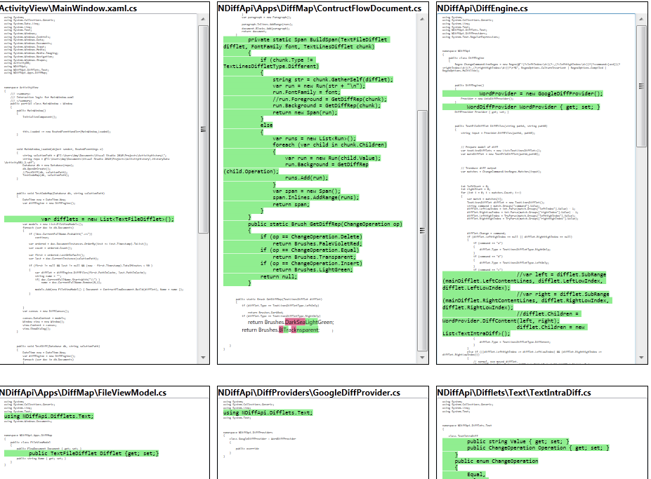
Diff Maps
Want an overview of a changeset? The diff map displays all the affected source files and overlays the changes over those files. It focuses on changes, making other non-changed code smaller. This gives you an idea of where a changeset occurred throughout the system. This is a variation of the pixel-line visualization of files (seesoft view).
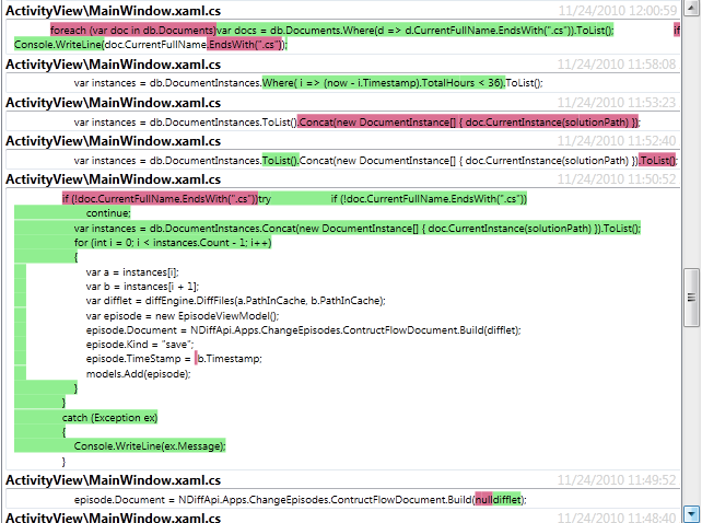
Change Episodes
Want a timeline of changes? Something that would let you mentally walk back in time, help you resume an interrupted task? Change episodes are created from local history (edits have timestamps) and reconstructed in the order you made the edit. This lets you see the changes as they happened and help restore your thoughts and trigger any reminders about code (oh, I still need to fix that!).
Rethinking typography
Most diff tools either change the foreground or background color to indicate modifications. Unfortunately, this tends to clash with our normal experience with viewing code – mainly syntax highlighting, but the highlighted colors can also be harder to read. What are some other ways to emphasize that a change occurred? Further, can we do more than color?
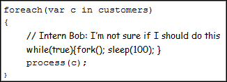
Some ideas: a distinct font to emphasize changes made by another team member, heavy fonts (not same as bold) to emphasize modifications.
Maybe comic sans has a place after all?
blog comments powered by Disqus