Keeping it Simple: Customizing the WPF Expander Icon
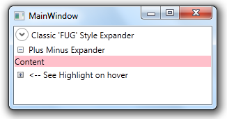
The default WPF expander is functional but is ugly. Many people have asked for simple examples for changing the look+feel, and most responses point to ripping the style template from Expression Blend and then customizing it. This is probably the third time I’ve needed to do this and each time looking at pages and pages of all that style code leaves me queasy.
The main reason the style is so bulky is that Expander style is written to account for several different orientations and positions of the expander icon. But most likely you’ll only need one anyways.
Finally, here is a simple example of customizing the expander icon with just 25% of the code produced by Expression Blend:
Get the full demo from github, or checkout these snippets below.
First the style for header and icon.
<Style x:Key="ExpanderHeaderFocusVisual">
    <Setter Property="Control.Template">
        <Setter.Value>
            <ControlTemplate>
                <Border>
                    <Rectangle Margin="0" SnapsToDevicePixels="true" Stroke="Black" StrokeThickness="1" StrokeDashArray="1 2"/>
                </Border>
            </ControlTemplate>
        </Setter.Value>
    </Setter>
</Style>
<Style x:Key="ExpanderDownHeaderStyle" TargetType="{x:Type ToggleButton}">
    <Setter Property="Template">
        <Setter.Value>
            <ControlTemplate TargetType="{x:Type ToggleButton}">
                <Border Padding="{TemplateBinding Padding}">
                    <Grid Background="Transparent" SnapsToDevicePixels="False">
                        <Grid.ColumnDefinitions>
                            <ColumnDefinition Width="15"/>
                            <ColumnDefinition Width="*"/>
                        </Grid.ColumnDefinitions>
                        <Image x:Name="icon" Source="closed.png"  Width="9"/>
                        <ContentPresenter Grid.Column="1" HorizontalAlignment="Left" Margin="4,0,0,0" RecognizesAccessKey="True" SnapsToDevicePixels="True" VerticalAlignment="Center"/>
                    </Grid>
                </Border>
                <ControlTemplate.Triggers>
                            <Trigger Property="IsChecked" Value="true">
                        <Setter Property="Source" TargetName="icon" Value="open.png"/>
                        </Trigger>
                </ControlTemplate.Triggers>
            </ControlTemplate>
        </Setter.Value>
    </Setter>
</Style>
And the style for the expander itself:
<Style x:Key="StatusGroupExpander" TargetType="{x:Type Expander}">
    <Setter Property="Foreground" Value="{DynamicResource {x:Static SystemColors.ControlTextBrushKey}}"/>
    <Setter Property="Background" Value="Transparent"/>
    <Setter Property="HorizontalContentAlignment" Value="Stretch"/>
    <Setter Property="VerticalContentAlignment" Value="Stretch"/>
    <Setter Property="BorderBrush" Value="Transparent"/>
    <Setter Property="BorderThickness" Value="1"/>
    <Setter Property="Template">
        <Setter.Value>
            <ControlTemplate TargetType="{x:Type Expander}">
                <Border BorderBrush="{TemplateBinding BorderBrush}" BorderThickness="{TemplateBinding BorderThickness}" Background="{TemplateBinding Background}" CornerRadius="3" SnapsToDevicePixels="true">
                    <DockPanel>
                        <ToggleButton x:Name="HeaderSite" ContentTemplate="{TemplateBinding HeaderTemplate}" ContentTemplateSelector="{TemplateBinding HeaderTemplateSelector}" Content="{TemplateBinding Header}" DockPanel.Dock="Top" Foreground="{TemplateBinding Foreground}" FontWeight="{TemplateBinding FontWeight}" FocusVisualStyle="{StaticResource ExpanderHeaderFocusVisual}" FontStyle="{TemplateBinding FontStyle}" FontStretch="{TemplateBinding FontStretch}" FontSize="{TemplateBinding FontSize}" FontFamily="{TemplateBinding FontFamily}" HorizontalContentAlignment="{TemplateBinding HorizontalContentAlignment}" IsChecked="{Binding IsExpanded, Mode=TwoWay, RelativeSource={RelativeSource TemplatedParent}}" Margin="1" MinWidth="0" MinHeight="0" Padding="{TemplateBinding Padding}" Style="{StaticResource ExpanderDownHeaderStyle}" VerticalContentAlignment="{TemplateBinding VerticalContentAlignment}"/>
                        <ContentPresenter x:Name="ExpandSite" DockPanel.Dock="Bottom" Focusable="false" HorizontalAlignment="{TemplateBinding HorizontalContentAlignment}" Margin="{TemplateBinding Padding}" Visibility="Collapsed" VerticalAlignment="{TemplateBinding VerticalContentAlignment}"/>
                    </DockPanel>
                </Border>
                <ControlTemplate.Triggers>
                    <Trigger Property="IsExpanded" Value="true">
                        <Setter Property="Visibility" TargetName="ExpandSite" Value="Visible"/>
                    </Trigger>
                    <Trigger Property="IsEnabled" Value="false">
                        <Setter Property="Foreground" Value="{DynamicResource {x:Static SystemColors.GrayTextBrushKey}}"/>
                    </Trigger>
                </ControlTemplate.Triggers>
            </ControlTemplate>
        </Setter.Value>
    </Setter>
</Style>
blog comments powered by Disqus